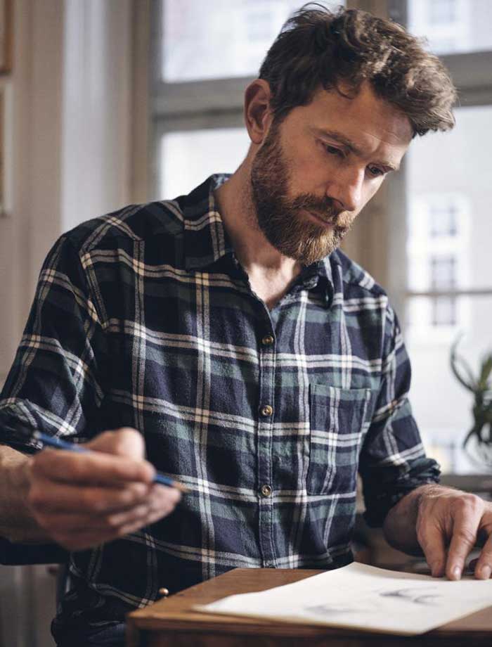
Danish illustrator Mads Berg collaborated with BoConcept to create a series of illustrations of their most iconic designs.
Executed as part of BoConcept’s celebratory year, the 600 limited edition prints, numbered and signed by the artist, feature six design icons by BoConcept: Imola armchair, Charlotte chair, Amsterdam sofa, Madrid tables, Kingston table and Princeton chair, and Cupertino desk and Ottawa chair.
In this interview, Berg, who’s widely known for his modern Art Deco inspired style, shares his experience of collaborating with BoConcept.

Your work shows a strong Art Deco influence. As a Danish illustrator, to which extent is your style inspired by Danish industrial design?
Art Deco is indeed one of my main influences, but there's actually more to it than that. It’s one of my sources of inspiration, as well as other styles such as Art Nouveau and Futurism.
What I really appreciate about Nordic furniture design is the fact that it’s driven by simplicity and functionality, that every element is there for a reason. Of course, you can also have some details that are only there for decoration purposes, and that’s actually what Art Deco is mainly about. By blending these two worlds together, that's when the magic happens.
The series includes six different iconic designs from BoConcept’s collection. What was your approach to bringing each different piece to life and creating this set of illustrations?
My goal was to create a varied and interesting set, with each piece looking different and unique, but still working well together with the others as a series.
In order to achieve this, in each illustration I used a different background colour, still consistent with the brand palette, and applied the same level of saturation throughout the series. I also played with different points of view, so some products are seen from a top-down perspective and others from a side view.
Another important tool is the graphic layer on top, quite subtle but adding consistency to the set.
And then, of course, the illustrations reflect my style, so the shadings, the structure, the texture and all the other elements are essentially connecting them as a series.
And what was your approach to the different shape, organic or geometric of each design?
In this series I wanted to explore the way in which the light plays with the shape of each design, and how the shadow is cast on the floor beneath it. I think it’s really interesting to see the interaction between the light and the different shapes and materials.
In some of the illustrations there is even some light play on the backdrop, to emphasise that there is a light source and a shadow cast. Adding some actors was really important as well, because some designs are shown at their best when someone is interacting with them.
About Mads Berg
Mads Berg is one of the world’s most prominent artists in his genre. His main fields of work are brand illustrations, key visuals, posters, maps, advertising and editorial illustrations, cover art, murals, map design, icon design, and type design.

