Downside Up House is an exercise in designing "big home features" on a small footprint. The house subverts the typical "rear-ground-level-extension-facing-a-backyard" approach without compromising on light, space and quality of living.
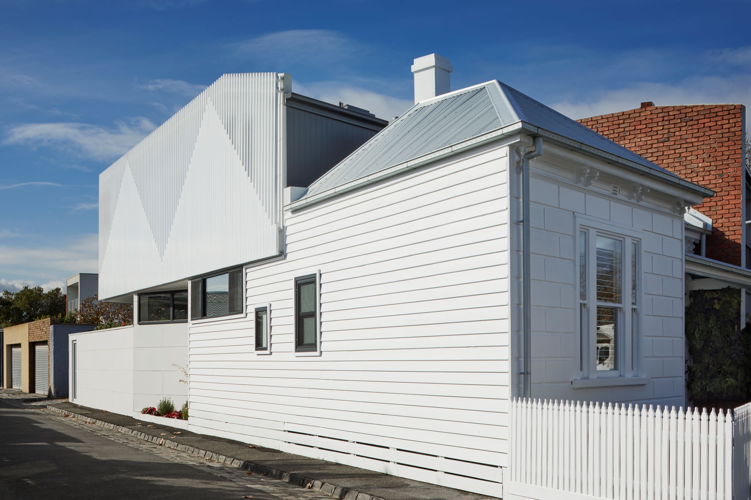
Nestled in a diverse neighbourhood pocket in Albert Park, the original building was a dilapidated double-fronted Victorian house bookended by a double-storey terrace house on its south side. The house is located on a corner allotment that is pinched in by the main street and a laneway which gives it its irregular, triangular "pizza" shape that tapers towards the rear. As a heritage listed building, it was imperative to rescue the front of house which was in a severe state of disrepair.
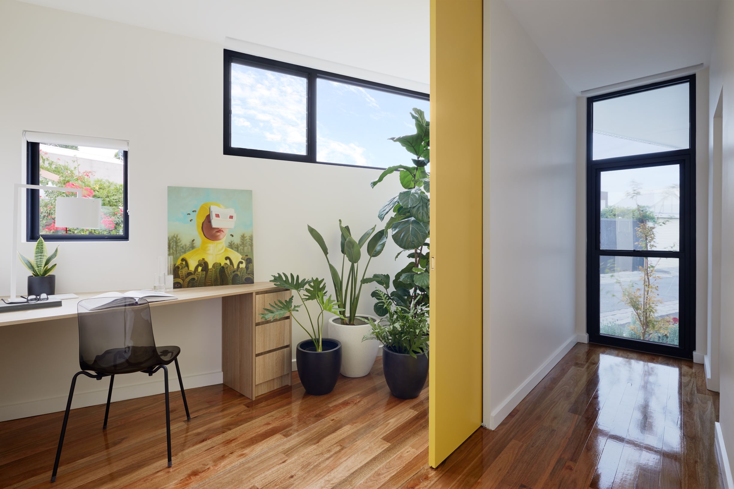
The homeowner and his family of 4 presented a brief that started off with the basic functional premise of maintaining a 3-bedroom house at the very minimum, and making use of the neighbour's double-height boundary wall to introduce a second storey volume to the rear of the property. In contrast to the convoluted and dimly-lit layout of the original house, the new extension had to be well-lit, feel larger than it is (despite its small footprint), and ultimately marry in seamlessly with the front heritage building.
The multiple rear lean-to structures were messy in their layout and clustered in an ad-hoc fashion, so the goal was to retain and restore the existing front of house while improving the flow and functionality of the old and new wings of the dwelling. A typical "rear-ground-level-extension-facing-a-backyard" treatment was impractical for this house, so the architect subverted the status quo by placing the living spaces upstairs and having all bedrooms organised at ground level. This helps to borrow inherent privacy and security afforded by a new boundary wall facing the laneway, while making the bedrooms feel "sheltered". Upstairs, the living spaces now sit above the neighbouring roofline and are able to open towards uninterrupted views and daylight.
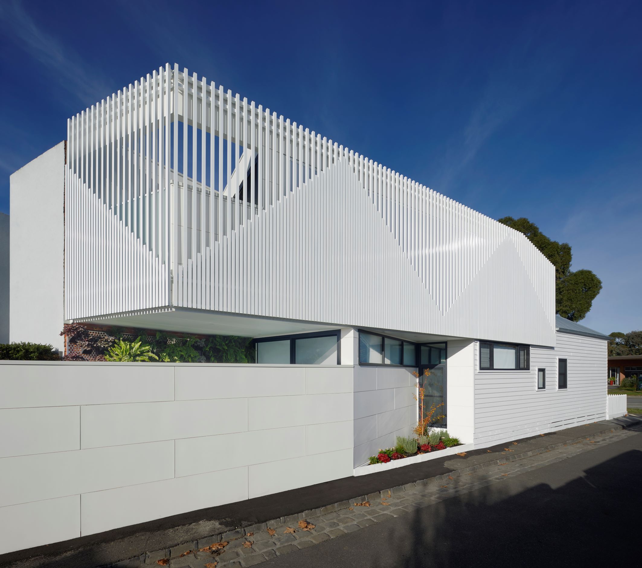
The façade treatment and articulation of the new addition drew inspiration from the previous forms of the old lean-to structures. The new façade celebrates the classic pitched roofs of old Victorian homes in the neighbourhood by referencing these triangular shapes in the upper floor's external batten screen. This batten screen not only presents a clear external graphic to the laneway, but also protects privacy by shielding views into the neighbours' gardens. A full-height clear polycarbonate wall on the internal face of the upstairs living spaces still allows northerly light into the rooms. During the day, soft light illuminates the elevated living spaces and when the sun sets, these spaces become lanterns under the night sky.
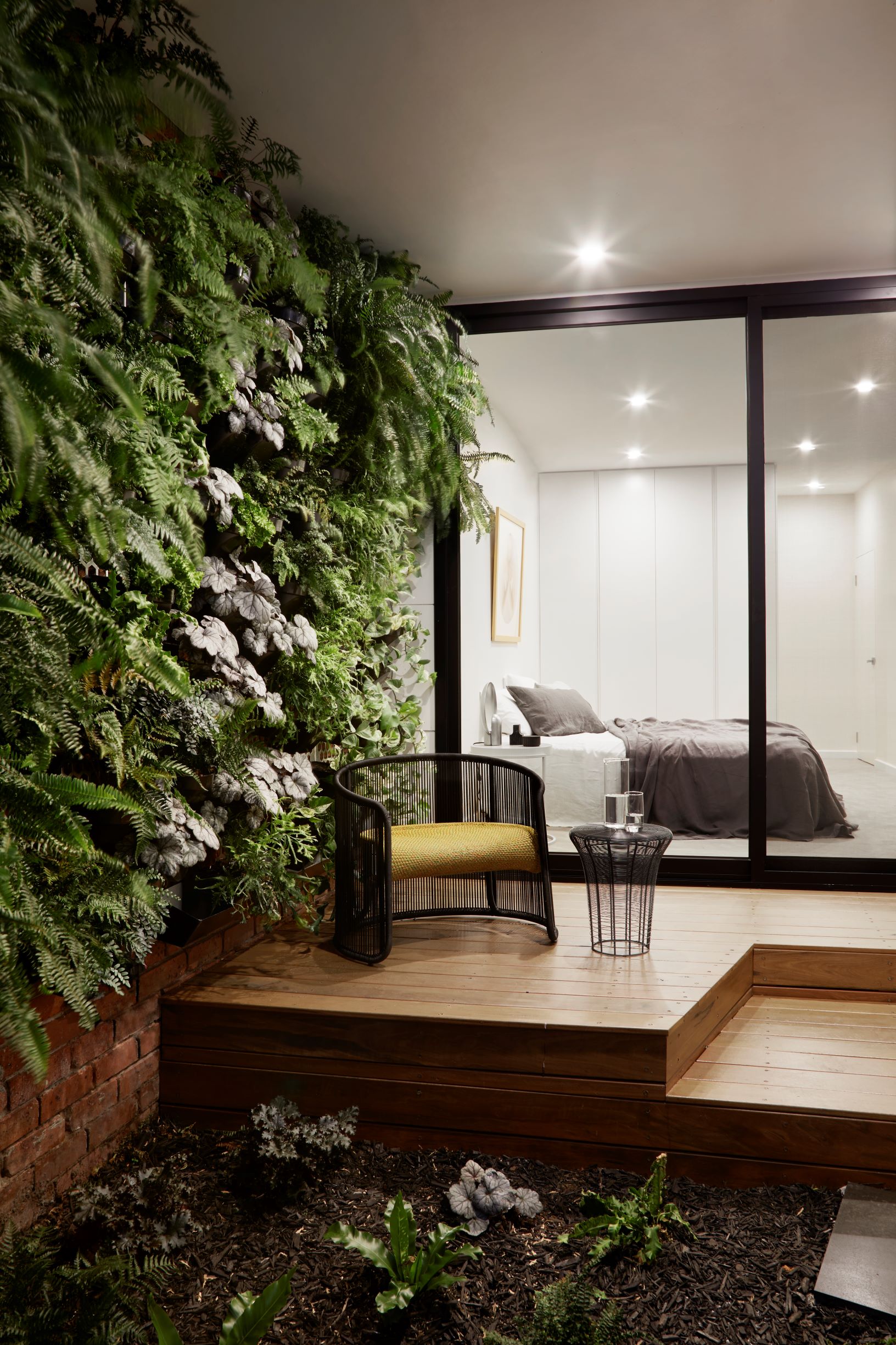
A strong colour palette of whites was employed to elevate the visual impact of the house and give it the crisp and clean look the original building desperately needed. The polycarbonate wall plays a part in bringing more light into the belly of the home. Rather than succumbing to a traditional solid wall punctuated with windows, this translucent wall was designed to literally be a "wall of light" and emanate diffused daylight uniformly into the main living zones.
The irregularly-shaped site allowed the introduction of a "shared garden" at street level; a departure from the harsh treatment along the laneway as seen in many other corner allotments in the area. The architects wanted a feature that promotes engagement with the street and its pedestrians, and this was achieved by angling the proposed boundary fence towards the house to carve out a piece of garden at a human scale. Despite the house's small footprint, this effort was made to ensure that a part of the house could be shared with the community.
